Moajjem H. - Strategic Designer Portfolio

On-Time Delivery98%
Experience12+ Years
Projects700+ Completed
Marketing Creative
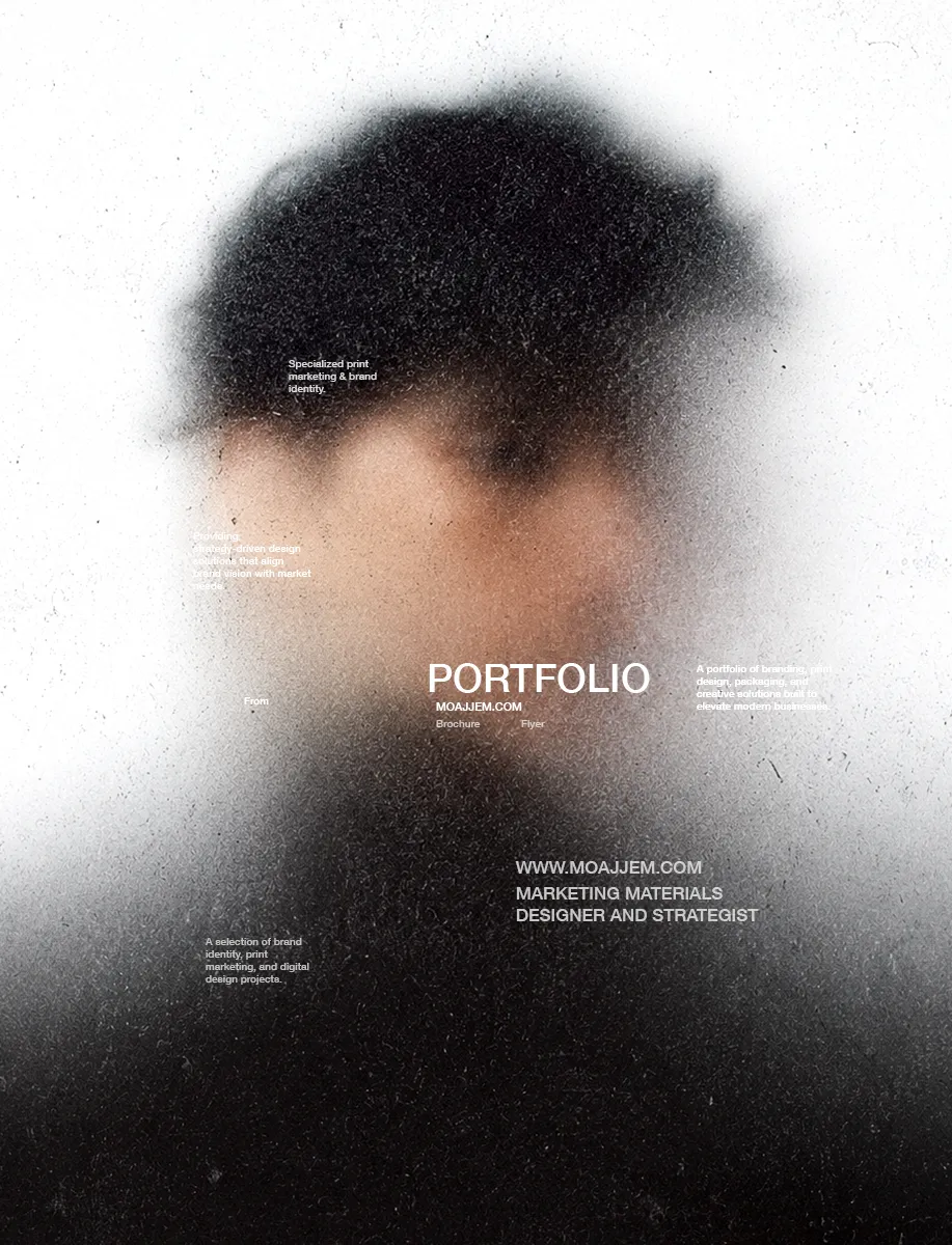
Providing strategy-driven design solutions that align brand vision with market needs.
The Early Grind
Proudly designed Bangladesh’s official away kit for the 2021 T20 World Cup.
The Breakthrough
The “Beyond Blocks” project showed me how clear, focused design can stand out.
Featured Works
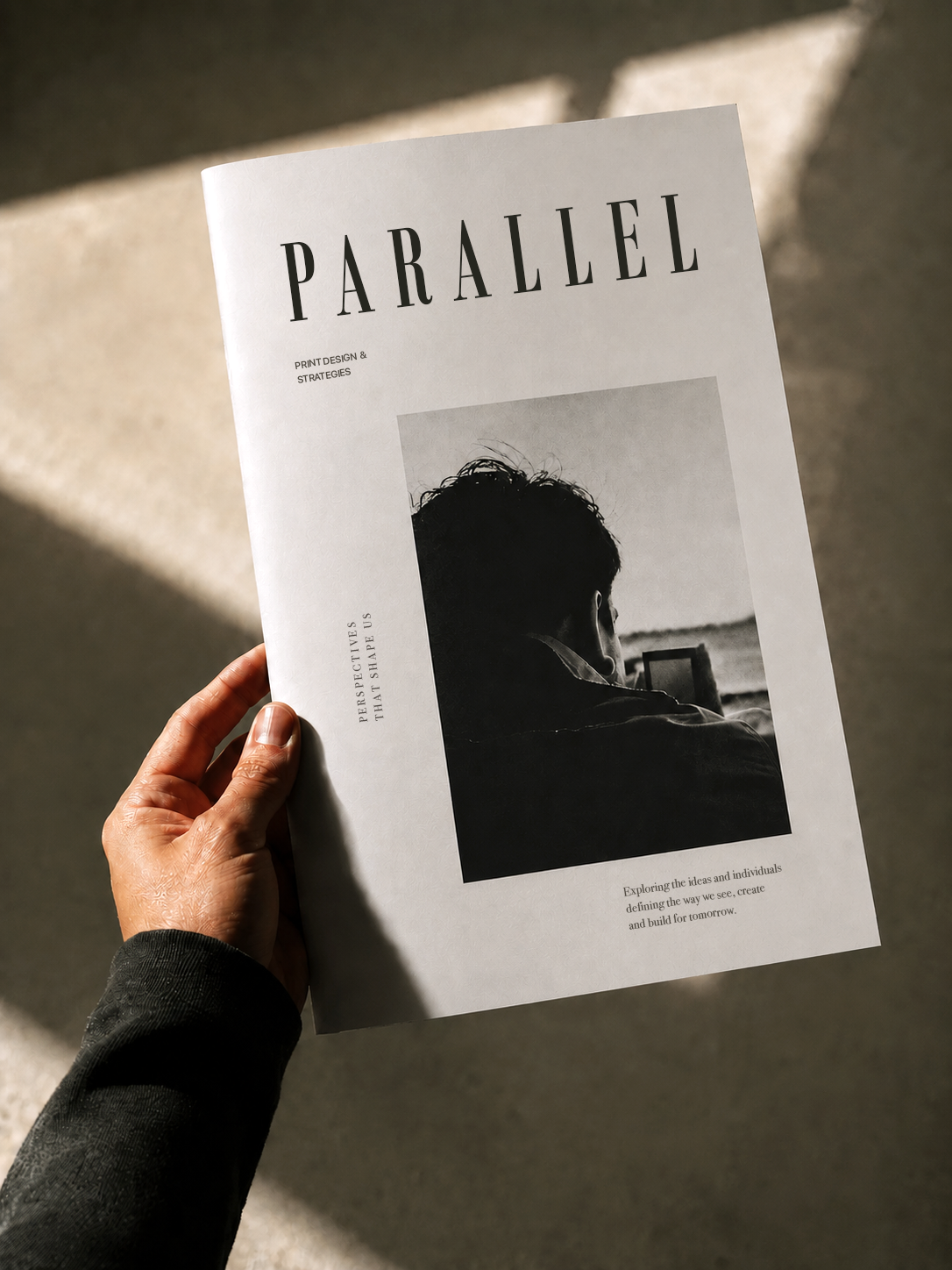
A selection of brand identity, print marketing, and digital design projects.